You are here: Foswiki>Andypublic Web>DataVisualisationUsingHeatmaps (16 Jan 2009, andyp)Edit Attach
Making Sense of Information
I work to help people understand information which is too large or complex to make sense of using standard office software. Common areas in which this is applied include- Questionnaire Analysis - Including reporting, data visualisation and data mining
- Database Analysis - Gain a greater understand your customers, donors or any database
- Data Visualisation - See the trends and patterns in information using clear and specialised graphics.
- Data Mining - Easily understandable summaries including tree diagrams, and predictions such as estimating customer value.
- Traditional Statistics - Ensuring you can tell what's really relevant and what is just statistical "noise".
Heatmap Visualisation
Converting information into pictures can make a dramatic difference. Patterns are revealed and information is easier to understand. Below are some examples of my work using heatmap visualisation. It's a technique you probably won't have seen before, but it can be used to present very large amounts of information clearly.Birmingham Council Elections 2007
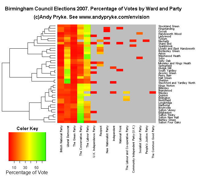
The picture below shows the percentage of votes obtained by each party in each ward. Red indicates a low vote for a particular party in that ward, green a high vote. The colour key shows the actual percentages. A clear clustering of wards is visible, with the lower half of the diagram dominated by wards with a high Tory vote, the centre by Lib-Dem (mainly with Labour in second place) and the top by Labour wins. If you know the geography of Birmingham, you'll notice that some of the wards which vote similarly are close together (as we might expect), for example, note the four "Sutton..." wards listed at the bottom right. The data was compiled from the Birmingham City Council website, you can download the election results data file (csv) if you'd like.
You can see the "Party's Eye View" of the election here.
Reproduction Rights
You're welcome to reproduce this image as long as it remains completely unchanged. This includes reproducing the title and url "www.andypryke.com/envision" at the top of the picture. I'd be grateful if you would provide a like to that URL and email me to let me know if you've reproduced it or found the diagram useful. Thanks, AndyDrug Dangers
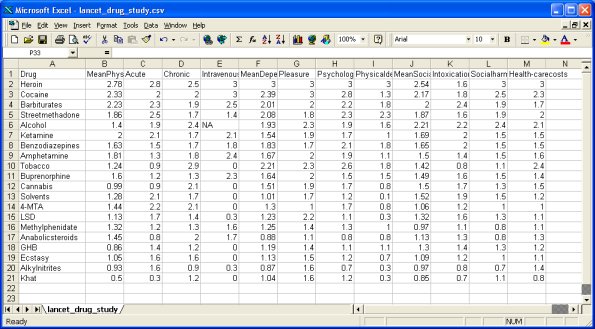
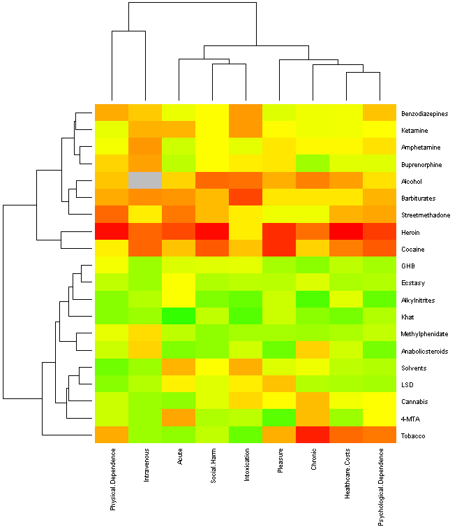
In March 2007, a paper on the dangers of different drugs hit the news headlines. The paper was "Development of a rational scale to assess the harm of drugs of potential misuse" by David Nutt, Leslie A King, William Saulsbury, and Colin Blakemore. It was published in the Lancet, and you can download a pdf copy here. The paper measured the harmfulness of 20 substances on 9 different measures. The data collected looked like this: I transformed the data into a simpler to understand form. In the visualisation below, Red means most "danger", yellow indicated less of a problem and green the least harm. The grey square for "intravenous use of alcohol" indicates that no score was given for this. I also re-arranged the rows and columns so that similar drugs appeared next to each other. You can trace these similarities in the tree on the left.
For example, the red and dark orange rows across the centre of the diagram clearly show how heroin and cocaine are ranked as particularly dangerous across the board. However, at the bottom of the diagram, tobacco is particularly bad in terms of long term (chronic) effects and healthcare costs but much less harmful in terms of it's social and intoxicant effects.

References
- Bristol University Press Release - http://www.bris.ac.uk/news/2007/5367.html
- The original paper (pdf).
Contact Details
If you would like help or information to help you understand your data, or if you have suggestions for public data you'd like to see analysed here, please contact me at andy(at)andypryke.com.| I | Attachment | Action | Size | Date | Who | Comment |
|---|---|---|---|---|---|---|
| |
birmingham20070403.csv | manage | 12 K | 04 May 2007 - 16:34 | Unknown User | Election Results - Data File |
| |
election.png | manage | 14 K | 04 May 2007 - 16:49 | Unknown User | Fixed slash |
| |
election_partys_eye_view.png | manage | 14 K | 04 May 2007 - 17:32 | Unknown User | Party's Eye View of Election Results |
| |
heatmap.png | manage | 7 K | 15 Apr 2007 - 12:22 | Unknown User | Updates Colour Scheme |
| |
lancet_data_screen_shot.png | manage | 7 K | 15 Apr 2007 - 12:20 | Unknown User | Updates Colour Scheme |
| |
lancet_data_screen_shot_smaller.jpg | manage | 58 K | 06 Apr 2007 - 18:42 | Unknown User | Data in spreadsheet |
Edit | Attach | Print version | History: r8 < r7 < r6 < r5 | Backlinks | View wiki text | Edit wiki text | More topic actions
Topic revision: r8 - 16 Jan 2009, andyp
Favourite Pages
My Blog
Best Of Blog 2007
Best Of Blog 2005 Birmingham,
How to be Happy,
Influenza Pandemic,
Moseley Tornado,
Misty's Big Adventure,
Street Furniture Stickers,
Weird Internet Animations
Other People's Blogs
Birmingham Bloggers Danger! High Postage,
Parallax View,
Pete Ashton,
Silent Words Speak Loudest
Please don't ask for a sidebar link as a refusal often offends. Editorial Policy
 Copyright © by the contributing authors. All material on this collaboration platform is the property of the contributing authors.
 Ideas, requests, problems regarding Foswiki? Send feedback


